
I have been experimenting with Bootstrap 4.0 Beta 2 and there seems to have been a lot of questions on how to extend this new version. While this may not be final or the only way to do it – this is what I have come up with so far. Here we will set up _custom_variables.scss and _custom_mixns.scss files that modify or extend the default Bootstrap and then use these variables and functionality within our own styles.scss file. I will show you how to modify default Bootstrap variables such as $blue, and add a new custom color which will not only be reflected in our custom Bootstrap, but then can also be accessed from our own styles.scss file. In addition we will create a mixin to create a gradient for the background. Finally we will add a new size variable that we will then be able to access in our styles.scss file. What we will ultimately end up with is something that looks like the graphic above.
Bootstrap 4.0 Beta 2 to Bootstrap 4.0 Beta 3
In the previous article - Customizing Bootstrap 4.0 Beta 2 – Overriding Default Theme Colors I laid out the environment, and the initial files. This article continues on from that one so make sure you look over that one for all the background info such as directory structure, package.json file, etc. The only different is that this will be using the latest Bootstrap 4.0 Beta 3. There actually weren’t any coding changes I had to make to get this to work on Beta 3 so it will also work in Beta 2. The ONE change I did have to make if you want to use Bootstrap 4.0 Beta 3 is to change the package.json file. Change the Bootstrap dependency from “bootstrap”: “^4.0.0-beta.2” to “bootstrap”: “^4.0.0-beta.3”.
Creating the Initial SCSS Files
There are four scss files we need to create – _custom_variables.scss, _custom_mixins.scss, custom_bootstrap.scss and styles.scss.   All of these files will be saved in the /src/scss directory.
Save an empty file called “_custom_mixins.scss“. We will come back to this file later.
Next we create the _custom_variables.scss file which contains the following…
// need this imported for the custom_bootstrap.scss file and to use any functions within this file.
@import 'node_modules/bootstrap/scss/functions';
// need this to get the default Bootstrap variables
@import 'node_modules/bootstrap/scss/variables';
Create the custom_bootstrap.scss file which contains the following…
// import our custom_variables file
@import 'custom_variables';
// import the default bootstrap file
@import "node_modules/bootstrap/scss/bootstrap";
Finally we need to create the style.scss file…
@import 'node_modules/bootstrap/scss/mixins';
@import 'custom_mixins';
@import 'custom_variables';

html,
body
{  min-height:100%;
}
What we are doing here is importing our custom files and the default Bootstrap mixin.scss file so we can use the variables and mixins within our own styles.scss file. You will see how this works as we build this out.
Creating the index.html File
Now create the index.html file with following HTML and save it to the /public/ directory.
<!DOCTYPE html>
<html lang="en">
<head>
<meta charset="UTF-8">
<meta name="viewport" content="width=device-width, initial-scale=1.0">
<meta http-equiv="X-UA-Compatible" content="ie=edge">
<title>Document</title>
<link rel="stylesheet" href="assets/css/custom_bootstrap.css">
<link rel="stylesheet" href="assets/css/style.css">
</head>
<body>
<div class="container">
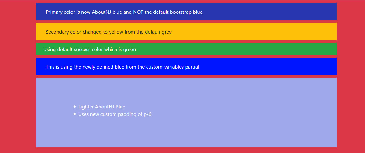
<div class="row p-3 my-2 bg-primary text-white">
<div class="col-12">Primary color is now AboutNJ blue and NOT the default bootstrap blue</div>
</div>
<div class="row p-3 my-2 bg-secondary text-black">
<div class="col-12">Secondary color changed to yellow from the default grey</div>
</div>
<div class="row p-2 my-2 bg-success text-white">
<div class="col-12">Using default success color which is green</div>
</div>
<div class="row p-3 my-2 bg-blue text-white">
<div class="col-12">This is using the newly defined blue from the custom_variables partial</div>
</div>
<div class="row p-6 my-2 bg-lighter-aboutnj text-white">
<div class="col-12">
<ul>
<li>Lighter AboutNJ Blue</li>
<li>Uses new custom padding of p-6</li>
</ul>
</div>
</div>
</div>
</body>
</html>
Now if you execute Gulp and everything is set up properly – you should see the following in your browser…

Now if everything worked it is time to CUSTOMIZE.
Customizing Bootstrap – changing the primary and secondary colors
This will really just get the color scheme to be what it was at the end of the last lesson – Customizing Bootstrap 4.0 Beta 2 – Overriding Default Theme Colors
Add the following to the end of the _custom_variables.scss file…
$AboutNJ: #2637b0;

$colors: (
  'AboutNJ': $AboutNJ,
);

$theme-colors:(
  primary: $AboutNJ,
  secondary: $yellow,
);
Here we have defined a new blue color and assigned it to the variable $AboutNJ. We have then added this color to the $color map and have also assigned it to the primary element in the $theme-colors map. Finally we have changed the secondary element in the $theme-colors map to be $yellow. We didn’t have to define the $yellow variable because it is already defined in the default bootstrap _variables.scss file.
You should now see the following in your browser…

Defining the bg-blue Class and its color
If you notice we have a fourth div that does not appear. This is because we have a class that defines its color and we have not defined that class in our style.scss file.
First define the class within the style.scss by adding the following…
.bg-blue
{  background-color: color('blue');
}
Now if you view the page in the browser you won’t see any changes.  This is because we are using a Bootstrap defined function “color” here to obtain the value for blue which obtains the color from the $color map. In order to access any of the map variables within our own styles.scss file in this manner, we need to have the system bring these variables into our $colors map in our _custom_variables.scss file.
To do that simply reimport the the default Bootstrap _variables file again at the very end of our _custom_variables.scss file by adding this…
// need this to update the maps. Need to maake sure all the previous colors, along with the new redefined blue are in the map.
// Without this, red, yellow, etc would not be defined to be used in the style.scss file.
// this also fixes up the root values
@import 'node_modules/bootstrap/scss/variables';
Now if you view the page in the browser you should see the following…

But this is still using the default Bootstrap blue since we haven’t actually redefined the blue color yet. To do that, add this variable to the _custom_variables.scss file after the $AboutNJ variable so it looks like this…
$AboutNJ: #2637b0;
$blue:    #0015ff;
Now if you view the page you should see the following…

Defining the Lighter AboutNJ Blue Color
You will notice that there is still another div that is not displaying because we have not defined its color in our styles.scss file. Let’s set a variable to contain the lighter AboutNJ blue color in the _custom_variables.scss file by adding the following AFTER the $theme_color map…
$lighter-aboutNJ: lighten(theme-color("primary"), 35%);
This alone won’t change the page because now we haven’t defined the .bg-lighter-aboutnj class to our styles.scss file
.bg-lighter-aboutnj
{  background-color: $lighter-aboutNJ;
}
Now with those changes to the _custom_variables.scss and the styles.scss files you should see the following…

Defining a New Spacer for Margins and Padding
If you notice, while the lighter-AboutNJ div is the correct color, I actually have it set to use a default padding called p-6.
If you look at the Bootstrap _variables.scss file you will see these lines which is used to define the spacing for margins and padding…
$spacer: 1rem !default;
$spacers: (
  0: 0,
  1: ($spacer * .25),
  2: ($spacer * .5),
  3: $spacer,
  4: ($spacer * 1.5),
  5: ($spacer * 3)
) !default;
This map is used to create the p-1, m-1, py-2, etc.
Now what we want to do is add a 6th element without recreating the Bootstrap map. To do that we can have the system create this for us based on what Bootstrap has already given us by simply adding a few lines to our styles.scss file after the $lighter-aboutnj variable definition…
$spacers: map-merge((
  6: ($spacer * 5),
), $spacers);
When you view the page you should now see the following…

If you check browser’s webtools you can see that the p-6 was properly created with a value of 5rems.

This is calculated by taking the Bootstrap’s $spacer value of 1rem times 5 which we set in our modified map.
Adding the Gradient Mixin
Now we are on the final step and that is to add the gradient to the background. Here we are going to finally add some code to our _custom_mixins file and we will then use it in our styles.scss file.
In the _custom_mixins.scss file add the following…
@mixin gradient-bg-2($color) {
  @if $enable-gradients {
    background: linear-gradient(0deg, $body-bg, $color 40%, color('green'));
  } @else {
    background-color: $color;
  }
}
What this is doing is taking the color we have defined in in $body-bg, the color we pass to it within the $color variable and the color green to create a gradient. Now we need to use it in our styles.scss file so we add the following…
body
{ @include gradient-bg-2(color('red'));
}
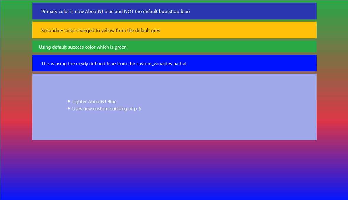
But wait – when you view the page we do NOT get the gradient, instead we get the this…
So why is that? Because if we look at our gradient code you will see that it checks the value of $enable-gradient and if this is false it will just set the background-color to whatever we pass into $color. By default Bootstrap sets $enable-gradient to false in version 4.0 and you can confirm this by looking at Bootstrap’s _variable.scss file where it has this line…
$enable-gradients: false !default;
To override this we simply add this line to our _custom_variables.scss…
$enable-gradients: true;
Now when viewed in the browser we see the following…

But that still is not right. Where is the blue? Well the blue is being added to the gradient with the variable $body-bg. The default Bootstrap value for $body-bg is white as defined in the _variables.scss file. If we want this variable to be blue instead, we need to set it within our _custom_variables.scss file add this line…
$body-bg: $blue;
Now when you view the page you should see the full gradient…
Please be aware that changing the $body-bg color was just an example. That color is used to define a number of other variables and making such changes to a variable may of unintended consequences. For instance – if you look at the _variables.scss file you will see $body-bg used in five places…
$body-bg:                   $white !default;
$table-dark-color:            $body-bg !default;
$custom-control-indicator-focus-box-shadow:     0 0 0 1px $body-bg, $input-btn-focus-box-shadow !default;
$nav-tabs-link-active-bg:           $body-bg !default;
$thumbnail-bg:                      $body-bg !default;
I have not tested how everything is affected by changing the $body-bg variable.
Comments Welcome
If you have anything to add or additional insight, please include it in the comments.  As I said – this is what I came up with to accomplish much of what I wanted to do with Bootstrap 4.0, but there may be something I am missing or a better way to do something.